Fact Check: Paleoclimate Graph Disputes Global Warming
Paleoclimate Graph Disputes Global Warming

Claim :
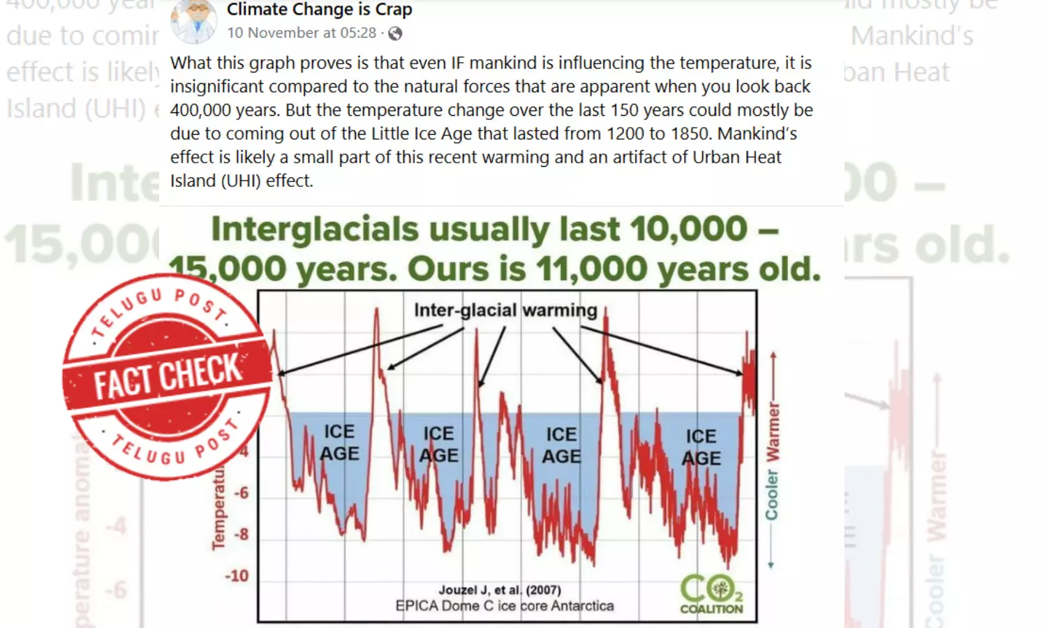
A graph showing the current warming trends are insignificant compared to natural temperature fluctuations over the last 400,000 years. It implies that human-induced carbon emissions have minimal impact on climate change, attributing recent warming to natural cycles and the Earth emerging from the "Little Ice Age."Fact :
The graph is misleading because it ignores the last 150 years of temperature data, which clearly shows t
The social media post, originally shared on November 10, 2024, includes a graph depicting natural cyclical temperature variations over hundreds of thousands of years. This data, which was published by the CO2 Coalition, shows Earth's temperature changes in relation to ice ages and interglacial periods. The post argues that these natural cycles, not human activity, are the primary drivers of temperature fluctuations, specifically dismissing human-induced carbon dioxide emissions as a significant factor in recent warming trends. "What this graph proves is that even IF mankind is influencing the temperature, it is insignificant compared to the natural forces that are apparent when you look back 400,000 years. But the temperature change over the last 150 years could mostly be due to coming out of the Little Ice Age that lasted from 1200 to 1850," claimed the post.
Supporters of this claim also point to the "Little Ice Age" (circa 1200–1850) as evidence that recent warming trends could be natural, rather than anthropogenic (human-caused).
Fact Check:
Scientists predict that 2024 will be the hottest year on record, with the rapid warming clearly linked to human-driven carbon emissions. However, climate change skeptics are using social media to question these findings, sharing a graph that shows natural temperature cycles from ice age periods. Experts say this graph is misleading because it ignores the last 150 years of temperature data, which clearly shows the impact of human activity on global warming.
Ice ages are driven in part by natural variations in Earth's orbit, which affect the amount of sunlight the planet receives, combined with the influence of greenhouse gases that contribute to warming.
The most recent glacial period lasted from approximately 120,000 to 11,500 years ago (archived here). Since then, Earth has been in an "interglacial period"—a warmer phase in which ice coverage on land is significantly reduced.
Similar claims have circulated on social media, often shared by climate skeptics such as former Fox News commentator Steve Milloy, whose arguments have been repeatedly debunked.
"We are currently in what is known as an interglacial or warm period. While natural variations in climate are substantial," said Donald Canfield, a geology professor at the University of Southern Denmark on November 22, "this does not rule out the significant impact humans can have on recent warming trends."
The United Nations Intergovernmental Panel on Climate Change (IPCC) asserts that it is "unequivocal that human influence has warmed the atmosphere, ocean, and land," primarily due to CO2 emissions.
"Both CO2 levels and temperatures have risen to levels significantly higher than those observed before the 'Little Ice Age' began," noted Donald Canfield. "There is broad scientific consensus that the recent increase in CO2 is driven by human activity, and, consequently, so is the associated rise in temperatures."
Experts have also highlighted that the graph shared online fails to refute the role of human-driven emissions in climate change or its critical impact.
"The graph omits recent warming trends, stopping short of capturing the period where human climate impacts became significant," explained Bärbel Hönisch, a professor of environmental sciences at Columbia University's Lamont-Doherty Earth Observatory (archived here), on November 21.
NASA space research scientist Thomas Fauchez pointed out that the graph uses data compiled by glaciologist and climatologist Jean Jouzel (archived here) but misrepresents it by applying mismatched time scales. "The time frame presented in the graph does not include the last 150 years with sufficient precision to account for the effects of the Industrial Revolution," Fauchez said.
In contrast, NASA's data effectively highlights the sharp rise in warming by comparing historical CO2 levels from ice core samples with modern direct measurements.
Reliable weather records, dating back to the late 1800s, coincide with widespread land surface temperature observations. For earlier periods, proxy data from geological cores provide insights into Earth's Ice Ages and broader climate patterns.
As CO2 concentrations increase, so do temperature anomalies, indicating that rising CO2 levels are a primary driver of Earth's warming trend, specifically over the last 150 years, as demonstrated in the NASA graphs.
Scientists highlight that today's human-driven carbon dioxide levels in the atmosphere are unparalleled in millions of years. NASA's Fauchez explains that the dramatic increase—from pre-industrial levels of 280 parts per million to the current 423.6 ppm—inevitably warms the planet. This rise in CO2 has led to a consistent increase in global surface temperatures, reflecting a significant accumulation of heat since the pre-industrial era.
The claim that recent warming trends are insignificant or entirely natural is misleading. Scientific evidence overwhelmingly shows that human activities, particularly CO2 emissions, are the primary drivers of the rapid temperature increase observed over the last 150 years. While Earth's climate has historically undergone natural cycles, the current rate and magnitude of warming are unprecedented and align with the industrial-era rise in greenhouse gas concentrations.
